What is Data Visualization?
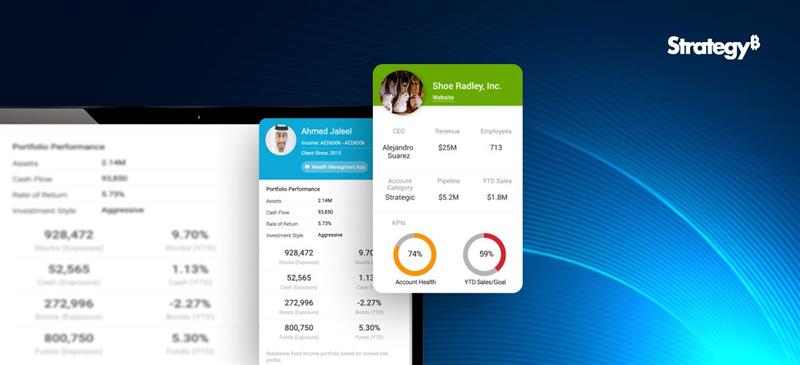
Data visualization is the process of representing data in a graphical or spatial format, allowing for easy visual analysis without technical jargon. Unlike raw numerical data, visual representations like charts, graphs, and maps help quickly identify patterns, trends, and anomalies, facilitating faster and more accurate insights.
Benefits of Data Visualization
Understanding raw data can be challenging due to its complexity. Data visualization addresses this by:
- Simplify Data Interpretation:
Converting raw data into charts and graphs makes it easier to understand underlying patterns and relationships. - Identify Trends and Anomalies: Visual formats highlight trends and anomalies that might be missed in numerical data.
- Improve Accessibility: Data visualization makes information accessible to a broader audience, including those without strong analytical skills, thus improving data-driven decision-making across departments.
- Advanced Data Storytelling: Effective visualization techniques turn data into compelling stories that facilitate better communication and understanding.
What Are Data Visualization Tools?
Data visualization tools provide designers with an efficient way to create visual representations of large data sets. When dealing with data sets that include hundreds of thousands or millions of data points, automating the visualization process simplifies the designer’s job considerably.
Key Benefits of Data Visualisation Tools
- Dashboards: To monitor and analyze key performance indicators (KPIs) and metrics in real-time.
- Annual Reports: To present data-driven insights to stakeholders in a clear and engaging manner.
- Sales and Marketing Materials: To showcase trends, performance, and forecasts to potential clients and customers.
- Investor Slide Decks: To communicate financial health and growth prospects effectively.
- General Information Interpretation: To make complex data understandable for decision-making processes in virtually any context where quick interpretation of information is necessary.
A Compact List of Top Data Visualization Tools
Here are the top enterprise data visualization tools for creating compelling visualizations:
- Tableau
- Google Charts
- Zoho Analytics
- Data Wrapper
Tableau
Tableau is a top-tier platform recognized for its user-friendly interface. It adeptly integrates data from multiple sources to create dynamic and visualisations.
Its comprehensive suite of products spans desktop applications, robust server solutions, and flexible web-hosted environments, empowering organizations to drive informed decision-making and achieve actionable insights across their operations.
Connect with us for a free demo: https://www.beinex.com/free-tableau-software
Who Should Use Tableau?
Data scientists and analysts who need to create custom dashboards and advanced visualizations will benefit from Tableau.
Key Features of Tableau
• User-Friendly Interface: Easy to learn and navigate, making it accessible for all skill levels.
• Mobile-Friendly: Create reports and dashboards optimised for mobile devices, allowing you to access and analyse data on the go.
• High Performance: Efficiently handles large datasets, ensuring seamless analysis without performance issues.
• Interactive Visualizations: Build interactive and dynamic visualisations, allowing deeper data exploration.
• Integration Capabilities: Integrates well with various data sources and other business applications, enhancing data connectivity.
• Real-Time Data Updates: Provides real-time data updates, ensuring you have the most current insights.
• Collaboration Tools: Facilitates easy sharing and collaboration on reports and dashboards within teams.
• Customizable Dashboards: Offers highly customisable dashboards to meet specific business needs and preferences.
• Advanced Analytics: Supports advanced analytics features, including trend analysis, forecasting, and statistical summaries.
• Security: Ensures data security with robust access controls and permissions.
Learn more: https://www.beinex.com/tableau-partnership-and-consulting-services/
Google Charts
Google Charts is a free tool for creating interactive data visualisations, accessible through most web browsers. It supports various data sources, including spreadsheets and databases.
Who Should Use Google Charts?
Students, universities, and businesses needing fundamental charts will find Google Charts useful.
Key Features of Google Charts
• User-Friendly Interface: Easy to use with a straightforward setup process.
• Wide Range of Chart Types: Supports various chart types, including line, bar, pie, scatter, and more.
• Customizable: Offers extensive customization options to tailor charts to specific needs, including colors, fonts, and annotations.
• Interactive Charts: Allows for interactive elements such as tooltips, zooming, and panning.
• Cross-Platform Compatibility: Ensures charts work seamlessly across different browsers and devices.
• Dynamic Data Updates: Supports real-time data updates, keeping charts current with live data feeds.
• Integration with Google Services: Easily integrates with other Google services such as Google Sheets and Google Analytics.
• Embedding Capabilities: Simple embedding in websites and applications with a few lines of code.
• Data Export Options: Provides options to export charts in various formats, including PNG, SVG, and PDF.
• Open Source: Free and open source, allowing for extensive customization and community support.
• Support for Multiple Data Formats: Works with various data formats, including JSON, CSV, and Google Spreadsheets.
• Accessibility Features: These include features to make charts accessible to all users, including screen reader support.
• Responsive Design: Ensures charts are responsive and adapt to different screen sizes and resolutions.
• Powerful API: Provides a robust API for developers to create complex visualisations and integrate them into applications.
Zoho Analytics
Zoho Analytics combines business intelligence and reporting services, allowing for swift data visualisation. It is user-friendly and integrates well with other Zoho products.
Who Should Use Zoho Analytics?
Analytics and sales teams, marketing teams, project managers, and more can benefit from Zoho Analytics.
Key Features of Zoho Analytics
• User-Friendly Interface: Intuitive design that simplifies data analysis and visualisation.
• Wide Range of Data Sources: Connects to various data sources, including databases, cloud storage, spreadsheets, and other business applications.
• Advanced Analytics: Offers features such as predictive analytics, AI-powered insights, and what-if analysis.
• Interactive Dashboards: Create and customise interactive dashboards with drag-and-drop ease.
• Collaboration Tools: Facilitate sharing and collaboration on reports and dashboards within teams.
• Embedded Analytics: Embed reports and dashboards into websites, applications, and portals.
• Automated Data Sync: Schedule data imports and synchronise data regularly.
• Customizable Visualizations: Provides a variety of chart types and extensive customisation options for data visualisations.
• Data Blending: Combine data from multiple sources for comprehensive analysis.
• AI-Driven Insights: Leverages AI to offer advanced analytical insights and pattern detection.
• Real-Time Data Access: Supports real-time data integration and live dashboards.
• Mobile Access: Access and interact with reports and dashboards on mobile devices.
• Data Security: Ensures robust security features, including role-based access control, encryption, and compliance with industry standards.
• Report Scheduling: Automate the distribution of reports through scheduled emails.
• Integrations with Other Zoho Apps: Seamlessly integrate with other Zoho applications for enhanced functionality.
• API Support: Provides APIs for developers to integrate analytics capabilities into custom applications.
• Data Preparation Tools: These include tools for data cleaning, transformation, and enrichment.
Data Wrapper
Data Wrapper is ideal for media enterprises and allows for the quick creation of charts, maps, and plots. It is completely web-based and easy to use.
Who Should Use Data Wrapper?
Data Wrapper can benefit media, news publications, government institutions and finance companies. It is especially useful for creating visually appealing and easily understandable visualisations.
Key Features of Data Wrapper
• User-Friendly Interface: Intuitive and easy to use, requiring no coding skills to create professional charts and maps.
• Wide Range of Chart Types: Supports a variety of chart types, including bar, line, pie, scatter plots, and maps.
• Customisable Visualizations: Offers extensive customisation options for colors, labels, and annotations to match branding and presentation needs.
• Responsive Design: Ensures charts and maps are responsive and adapt to different screen sizes and devices.
• Interactive Elements: Allows for adding interactive elements like tooltips, hover effects, and clickable legends.
• Real-Time Data Integration: Supports live data updates, enabling real-time visualisation.
• Embedding Capabilities: Easily embed charts and maps into websites and blogs with simple code snippets.
• Export Options: This option lets users download visualisations in various formats, including PNG, PDF, and SVG.
• Accessibility: Committed to creating accessible visualisations with features that support screen readers and keyboard navigation.
• Data Security: Ensures data security with robust privacy policies and compliance with industry standards.
• Collaboration Tools: Allows for team collaboration with shared projects and editing capabilities.
• Support for Multiple Languages: Offers multi-language support for creating visualisations in different languages.
• Easy Data Import: Supports importing data from various sources, including CSV files, spreadsheets, and web links.
• API Integration: Provides APIs for integrating Data wrapper with other applications and services.
• Customizable Templates: Use and modify templates to maintain consistency in visualisations.
• Annotation Features: Add rich text annotations directly to charts and maps to provide additional context and information.
Always Go for the Best Tool
By choosing the right data visualisation tool, organizations can discover the full potential of their data, making complex information accessible and actionable for everyone. This empowers businesses to make data-driven decisions that drive growth and innovation.