Industry
Automobile
Region
Middle East
Technology
Tableau Desktop & Tableau Prep
Automobile
Middle East
Tableau Desktop & Tableau Prep

Middle East’s automotive industry is among the fastest-growing sectors that are forerunners in acquiring and investing in new technological breakthroughs. Our client is a multinational automobile manufacturer which produces luxury vehicles and sports utility vehicles. Even amidst the pandemic, our client built its success through a strong global performance with a double-digit sales growth in the Middle East.

The client needed to benchmark the performance of their respective importers and retailers based on certain KPIs, thus allowing them to take corrective actions on the importers and retailers that are not performing as per expectations.
An analysis of 50+ KPIs was performed for these importers and retailers. Actuals were benchmarked against the targets to analyse the performance and a scorecard was created based on the same.


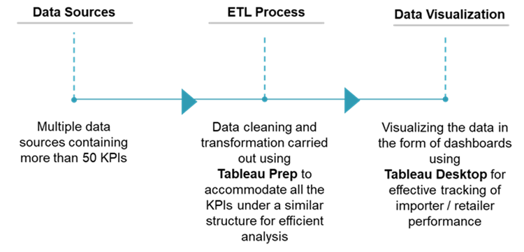
The process to achieve this requirement involved the use of two of Tableau’s powerful self-service tools: Tableau Desktop and Tableau Prep.
Since all the metrics used by the client were coming from different data sources, the data had to first be prepared, i.e., it had to be compiled together, cleaned, and transformed in such a way that insightful visualisations could be created out of the data. Tableau Prep was used to perform this data preparation, and the visualisations were created in Tableau Desktop.
The data preparation process was done by creating workflows that would handle the data cleansing, transformation processes in stages (4 stages of data preparation were carried out), hence making it easy for the user to understand every step involved in the data preparation process. At the end of the preparation process, the data was finally received in a way that it could be classified in different categories of KPIs (country classification, importer/retailer classification etc.); KPIs were segregated on whether they had achieved the target or not. KPIs could be selected based on the respective time period, and so on.
Additionally, the workflows created had reduced the manhours required to analyse the KPIs by 70%.
Now that the relevant data had been generated, this had to be shown in the form of captivating charts and indicators. This task was handled by Tableau Desktop.
Visualisations were created in such a way that the client could clearly differentiate between what all KPIs had achieved the specific target, this was done using colour indicators such as red and green. The client was able to compare metrics with regard to its respective importer and retailer. Also, they were able to select the period of the data to be viewed, and Tableau’s interactive dashboards allowed them to filter views and data with a single click.
With the help of these visualization, the accuracy with which the client made decisions had increased by 50%.


The client was able to accurately find out two importers that weren’t performing as per expectations. Corrective actions were implemented based on the findings.