1. Understand Your Audience
The best dashboards are built with a specific audience in mind. Consider who will be using your dashboard and what their goals are. Are they busy executives who need to quickly grasp key performance indicators (KPIs), or are they analysts who need to drill down into details? Once you know your audience, you can tailor your dashboard design to their needs.

Source: https://www.tableau.com/learn/whitepapers/10-best-practices-building-effective-dashboards?utm_medium=blog
2. Optimize Layout
In today’s mobile-first world, it’s important to design dashboards that look good and function well on a variety of devices. When designing your dashboard, consider how your audience will be consuming the information. If they’re primarily using mobile phones, you’ll need to prioritize the most important KPIs and optimize the layout for a small screen.
3. Minimize Page Load Times
No one wants to wait for a dashboard to load. Slow load times can be caused by a variety of factors, including the size of your data set and the complexity of your visualizations. To improve load times, you can optimize your data queries, use extracts, and leverage Tableau’s built-in performance optimization features.
4. Insights-Based Design
When designing your dashboard layout, consider how your audience will naturally “read” the information. Group related pieces of information together and use visual cues like shading, lines, and white space to guide the eye. The most important information should be placed in the upper left corner of the dashboard, as this is where most viewers will start looking.
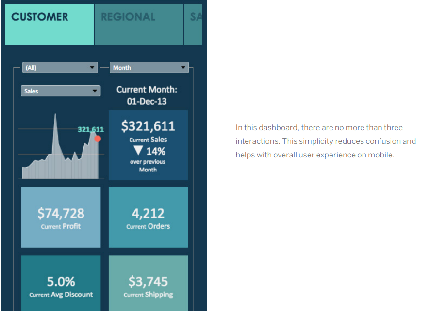
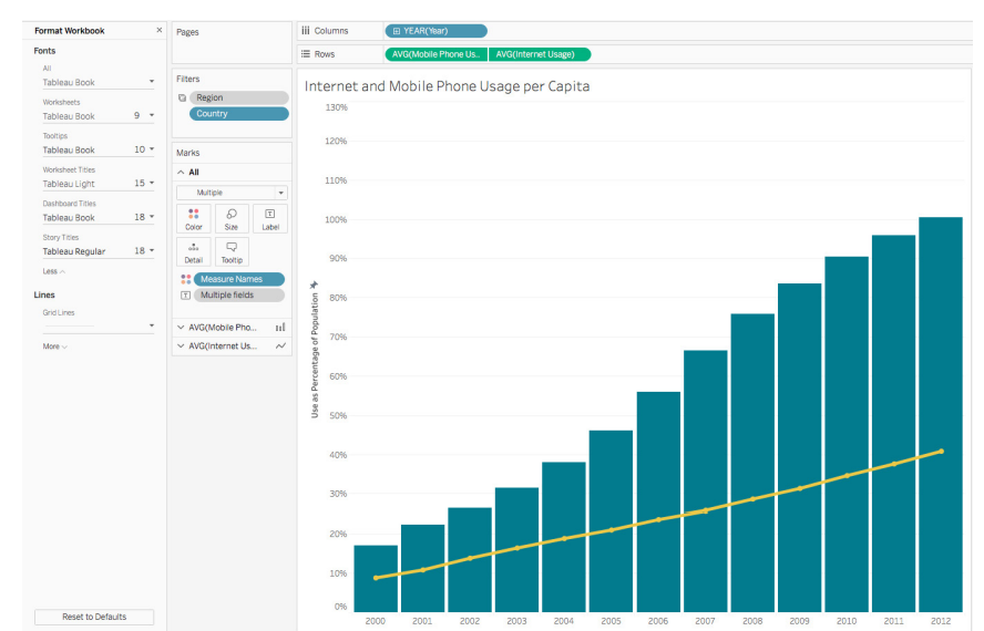
5. Minimize Views and Colors
It’s tempting to include every relevant piece of data in your dashboard, but this can lead to information overload. Stick to two or three key views, and use color strategically to highlight important trends or patterns. Avoid using too many colors, as this can make your dashboard visually overwhelming.
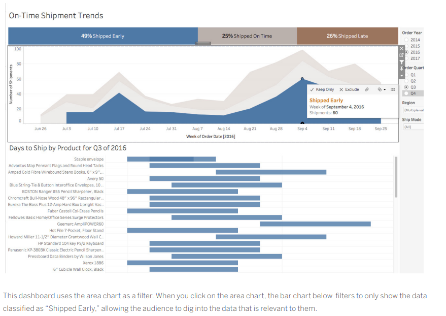
6. Incorporate Interactive Features
Dashboards are most powerful when they allow users to interact with the data. Use filters, highlights, and actions to let users explore the data in different ways. This will help them to gain a deeper understanding of the information and answer their own questions.
7. Arrange by Hierarchy
When formatting your dashboard, it’s best to start with the largest elements and work your way down to the smallest. This will help you to avoid accidentally overwriting your changes. The hierarchy of dashboard formatting typically follows this order: theme, workbook, and worksheet.
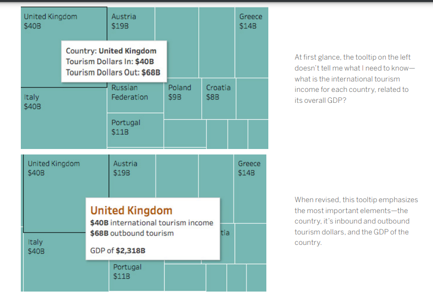
8. Utilize Tooltips and Whitespace for Effective Design
Tooltips are a great way to provide additional information without cluttering up your dashboard. Use tooltips to display detailed data points or to link to external resources. White space is also essential for good dashboard design. It helps to improve readability and make your dashboard less visually overwhelming.
9. Prioritize Clarity
Every element on your dashboard should serve a purpose. If a title, legend, or axis label isn’t necessary, get rid of it. Consider using a floating layout to create more white space and improve readability.

10. Ensure Dashboard Effectiveness
Once you’ve built your dashboard, it’s important to test it with your target audience. Ask them how they’re using the dashboard and if it helps them answer their questions. Use their feedback to iterate on your design and create dashboards that are truly effective.
By following these best practices, you can create dashboards that are clear, concise, and actionable. Effective dashboards will help your audience understand your data and make better decisions.
How Beinex Can Assist You
Beinex, a premier Tableau partner, provides sustainable analytics solutions to organizations and helps to build superior data visual analytics capabilities internally through our bespoke training programs. Our team of Tableau-certified consultants are real-life Tableau business users who are passionate about Tableau and delivering a world-class experience. Connect with us for a Tableau free trial: www.beinex.com/free-tableau-software
Image source: https://www.tableau.com/learn/whitepapers/10-best-practices-building-effective-dashboards?utm_medium=blog